TweetMeme Button

The Retweet button is for website and blog publishers that want to encourage their audience to retweet their content on twitter.

We have made our button really smart, with one simple piece of JavaScript we can give you up to date tweet counts and shorten your title and link for the retweets. Best of all it will work on any web page, anywhere!

The Code

Copy and paste the following code where you want the button to be displayed.

<script type="text/javascript" src="http://tweetmeme.com/i/scripts/button.js"></script>

Options

When the URL is different from the current URL

The button will automatically grab the URL of the page it is placed on. However if you want to place the button on more than one page or would like it in your feed, you will need to override the URL.

<script type="text/javascript">
tweetmeme_url = 'http://yoururl.com';
</script>
<script type="text/javascript" src="http://tweetmeme.com/i/scripts/button.js"></script>
Just replace http://yoururl.com with the URL of the page you want to retweet. The URL must be the final destination URL, not an alias, such as a link using a shortening service (eg. Bit.ly).

Changing the size of the button – Compact Button

The Compact=
The Compact Button

We also offer a compact version of the TweetMeme button, with the same options as the larger button.

<script type="text/javascript">
tweetmeme_style = 'compact';
</script>
<script type="text/javascript" src="http://tweetmeme.com/i/scripts/button.js"></script>

Changing the @username who is tweeted

By default the retweet button will be in the format of “RT @tweetmeme <title> <link>”. You can, however change the button to retweet your user account. By specifying the ‘tweetmeme_source’ parameter in the JavaScript you can change the format to “RT @yourname <title> <link>”.

<script type="text/javascript">
tweetmeme_source = 'tweetmeme';
</script>
<script type="text/javascript" src="http://tweetmeme.com/i/scripts/button.js"></script>
The example above would retweet in the format of “RT @tweetmeme <title> <link>”.

Changing the URL Shortener used

We have also added the ability to use a URL shortener of your choice instead of our default one.  If you would like to do this then you need to include the “tweetmeme_service” parameter as shown below:

<script type="text/javascript">
tweetmeme_service = 'bit.ly';
</script>
<script type="text/javascript" src="http://tweetmeme.com/i/scripts/button.js"></script>

Note: tweetmeme_service should be set to the name of the service you want to use.  For some services you also need to include the service API – Please see the example below for this.

<script type="text/javascript">
tweetmeme_service = 'awe.sm';
service_api = '12345678910';
</script>
<script type="text/javascript" src="http://tweetmeme.com/i/scripts/button.js"></script>

Silverlight Control Gallery

Namespace: System.Windows.Controls

The following is an alphabetical list of the common Silverlight controls

  • Border

  • Button

  • Calendar

  • Canvas

  • CheckBox

  • ComboBox

  • ContentControl

  • DataGrid

  • DatePicker

  • Grid

  • GridSplitter

  • HyperlinkButton

  • Image

  • InkPresenter

  • ListBox

  • MediaElement

  • MultiScaleImage

  • PasswordBox

  • Popup

  • ProgressBar

  • RadioButton

  • RepeatButton

  • ScrollBar

  • ScrollViewer

  • Slider

  • StackPanel

  • TabControl

  • TextBlock

  • TextBox

  • ToolTip

Border control provides a border, background, or both to another control. A border can contain only one child element.

Examples

The following example shows how to create a Border around some text.

<Border Background="Coral" Width="300" Padding="10" CornerRadius="20">
    <TextBlock FontSize="16">Text Surrounded by a Border</TextBlock>
</Border>

The preceding example produces output that is similar to the following illustration.

The following example shows how to put a border around several TextBlock objects contained in a StackPanel.

<Border BorderThickness="5" BorderBrush="Blue" >
    <StackPanel Grid.Column="0" Grid.Row="0">
        <TextBlock Text="One"/>
        <TextBlock Text="Two"/>
        <TextBlock Text="Three"/>
    </StackPanel>
</Border>

Button

The Button control reacts to user input from a mouse, keyboard, stylus, or other input device and raises a Click event. You can change how the button raises the ButtonBase..::.Click event by changing the ClickMode property. The Button is a ContentControl.

The following illustration shows Button controls in default and disabled states.

Syntax
C#
[TemplateVisualStateAttribute(Name = "Unfocused", GroupName = "FocusStates")]
[TemplateVisualStateAttribute(Name = "MouseOver", GroupName = "CommonStates")]
[TemplateVisualStateAttribute(Name = "Normal", GroupName = "CommonStates")]
[TemplateVisualStateAttribute(Name = "Pressed", GroupName = "CommonStates")]
[TemplateVisualStateAttribute(Name = "Disabled", GroupName = "CommonStates")]
[TemplateVisualStateAttribute(Name = "Focused", GroupName = "FocusStates")]
public class Button : ButtonBase

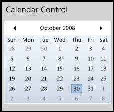
Calendar control provides a graphical UI for the user to select a date. It displays dates one month at a time, and provides the ability to scroll from month to month or switch to a yearly view.

cal

Syntax
C#
[TemplatePartAttribute(Name = "Root", Type = typeof(Panel))]
[TemplatePartAttribute(Name = "CalendarItem", Type = typeof(CalendarItem))]
public class Calendar : Control

Canvas

Canvas control provides a surface to display child elements at specific coordinates in the canvas. A canvas can contain one or more UIElement objects. For more information, see Silverlight Layout System.

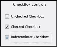
CheckBox control enables the user to select (check) or clear (uncheck) an option. The CheckBox can have three states: checked, unchecked, and indeterminate. Use a CheckBox to give the user an option, such as true/false or yes/no, or to select from a list of options. The CheckBox is a ContentControl.

The following illustration shows some check box controls in various states.

untitled
C#
[TemplateVisualStateAttribute(Name = "Unfocused", GroupName = "FocusStates")]
[TemplateVisualStateAttribute(Name = "Indeterminate", GroupName = "CheckStates")]
[TemplateVisualStateAttribute(Name = "Pressed", GroupName = "CommonStates")]
[TemplateVisualStateAttribute(Name = "Normal", GroupName = "CommonStates")]
[TemplateVisualStateAttribute(Name = "MouseOver", GroupName = "CommonStates")]
[TemplateVisualStateAttribute(Name = "Focused", GroupName = "FocusStates")]
[TemplateVisualStateAttribute(Name = "Unchecked", GroupName = "CheckStates")]
[TemplateVisualStateAttribute(Name = "Disabled", GroupName = "CommonStates")]
[TemplateVisualStateAttribute(Name = "Checked", GroupName = "CheckStates")]
public class CheckBox : ToggleButton

ContentControl represents a control with a single piece of content of any type. Many controls derive from ContentControl and can contain objects, such as a Button or a Panel.  You can customize the appearance of a ContentControl by applying custom templates.

DataGrid control provides a flexible way to display a collection of data in rows and columns. The built-in column types include a text box column, a check box column, and a template column for hosting custom content. The built-in row type includes a drop-down details section that you can use to display additional content under the cell values.

The DataGrid control supports common table formatting options, such as alternating row backgrounds and the ability to show or hide headers, gridlines, and scroll bars. Additionally, the control provides several style and template properties that you can use to change the appearance of the control and its rows, columns, cells, and headers.

DatePicker control enables a user to select a date by either typing it into a TextBox or by using a drop-down Calendar.

DatePicker shares many properties together with Calendar, so that you can control the range of displayable or selectable dates on a DatePicker and its drop-down Calendar at the same time. DatePicker also provides events for detecting the appearance or disappearance of the Calendar.

Grid

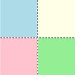
The Grid control provides a surface composed of rows and columns to display child elements. You define the rows and columns for a Grid, than assign objects to a specific row or column in the grid. You can optionally display gridlines. For more information, see Silverlight Layout System.

The following illustration shows a grid with two columns and two rows that contain colored squares. Gridlines are shown in this example.

untitled