Job Trends from indeed.com

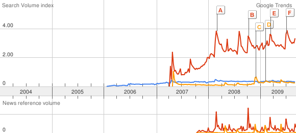
Silverlight vs Flex vs JavaFX from Google Trends

I was inspired by the Mike Slinn’s experiment and I have extended it a bit and I’ve compared trends for Adobe Flex, Silverlight and JavaFX jobs on Indeed.com and on Google Trends.

Scale is based on the average worldwide traffic of “silverlight” in all years. Learn more

“adobe flex”
0.18
“silverlight”
1.00
“javafx”
0.08

viz

you can go at: http://www.google.com/trends?q=%22adobe+flex%22%2C+%22silverlight%22%2C+%22javafx%22

Silverlight for Mobiles

Nokia today announced plans to make Microsoft Silverlight available for S60 on Symbian OS, while the availabilty for Series 40 devices and Nokia Internet tablets ill be confirmed at a later date.

Microsoft will demonstrate Silverlight on S60 during the opening keyote at Microsoft’s MIX08 conference on March 5 in Las Vegas. Silverlight is intended to be available to S60 developers later this year with initial service delivery anticipated shortly thereafter for all S60 licensees. This will allow S60 application developers to use an even wider range of development environments for S60 on Symbian OS than today. Today S60 developers can use: C++ (using native Symbian OS APIs and Open C providing subset of standard POSIX libraries), S60 Web Run-time (supporting standards-based web technologies such as Ajax, JavaScript, CSS and HTML), the Java(TM) language, Flash Lite from Adobe, and Python.

“This is an important relationship on so many levels. Working with Nokia means we are easily able to reach a huge number of mobile users, including customers of all S60 licensees. This is a significant step in gaining broad acceptance for Silverlight and ensuring it is platform agnostic. This is critical since we want to make sure developers and designers don’t have to constantly recreate the wheel and build different versions of applications and services for multiple operating systems, browsers and platforms,” said S. Somasegar, Senior Vice President of Microsoft’s Developer Division.

Silverlight Control Gallery

Namespace: System.Windows.Controls

The following is an alphabetical list of the common Silverlight controls

  • Border

  • Button

  • Calendar

  • Canvas

  • CheckBox

  • ComboBox

  • ContentControl

  • DataGrid

  • DatePicker

  • Grid

  • GridSplitter

  • HyperlinkButton

  • Image

  • InkPresenter

  • ListBox

  • MediaElement

  • MultiScaleImage

  • PasswordBox

  • Popup

  • ProgressBar

  • RadioButton

  • RepeatButton

  • ScrollBar

  • ScrollViewer

  • Slider

  • StackPanel

  • TabControl

  • TextBlock

  • TextBox

  • ToolTip

Border control provides a border, background, or both to another control. A border can contain only one child element.

Examples

The following example shows how to create a Border around some text.

<Border Background="Coral" Width="300" Padding="10" CornerRadius="20">
    <TextBlock FontSize="16">Text Surrounded by a Border</TextBlock>
</Border>

The preceding example produces output that is similar to the following illustration.

The following example shows how to put a border around several TextBlock objects contained in a StackPanel.

<Border BorderThickness="5" BorderBrush="Blue" >
    <StackPanel Grid.Column="0" Grid.Row="0">
        <TextBlock Text="One"/>
        <TextBlock Text="Two"/>
        <TextBlock Text="Three"/>
    </StackPanel>
</Border>

Button

The Button control reacts to user input from a mouse, keyboard, stylus, or other input device and raises a Click event. You can change how the button raises the ButtonBase..::.Click event by changing the ClickMode property. The Button is a ContentControl.

The following illustration shows Button controls in default and disabled states.

Syntax
C#
[TemplateVisualStateAttribute(Name = "Unfocused", GroupName = "FocusStates")]
[TemplateVisualStateAttribute(Name = "MouseOver", GroupName = "CommonStates")]
[TemplateVisualStateAttribute(Name = "Normal", GroupName = "CommonStates")]
[TemplateVisualStateAttribute(Name = "Pressed", GroupName = "CommonStates")]
[TemplateVisualStateAttribute(Name = "Disabled", GroupName = "CommonStates")]
[TemplateVisualStateAttribute(Name = "Focused", GroupName = "FocusStates")]
public class Button : ButtonBase

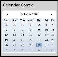
Calendar control provides a graphical UI for the user to select a date. It displays dates one month at a time, and provides the ability to scroll from month to month or switch to a yearly view.

cal

Syntax
C#
[TemplatePartAttribute(Name = "Root", Type = typeof(Panel))]
[TemplatePartAttribute(Name = "CalendarItem", Type = typeof(CalendarItem))]
public class Calendar : Control

Canvas

Canvas control provides a surface to display child elements at specific coordinates in the canvas. A canvas can contain one or more UIElement objects. For more information, see Silverlight Layout System.

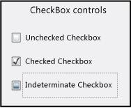
CheckBox control enables the user to select (check) or clear (uncheck) an option. The CheckBox can have three states: checked, unchecked, and indeterminate. Use a CheckBox to give the user an option, such as true/false or yes/no, or to select from a list of options. The CheckBox is a ContentControl.

The following illustration shows some check box controls in various states.

untitled
C#
[TemplateVisualStateAttribute(Name = "Unfocused", GroupName = "FocusStates")]
[TemplateVisualStateAttribute(Name = "Indeterminate", GroupName = "CheckStates")]
[TemplateVisualStateAttribute(Name = "Pressed", GroupName = "CommonStates")]
[TemplateVisualStateAttribute(Name = "Normal", GroupName = "CommonStates")]
[TemplateVisualStateAttribute(Name = "MouseOver", GroupName = "CommonStates")]
[TemplateVisualStateAttribute(Name = "Focused", GroupName = "FocusStates")]
[TemplateVisualStateAttribute(Name = "Unchecked", GroupName = "CheckStates")]
[TemplateVisualStateAttribute(Name = "Disabled", GroupName = "CommonStates")]
[TemplateVisualStateAttribute(Name = "Checked", GroupName = "CheckStates")]
public class CheckBox : ToggleButton

ContentControl represents a control with a single piece of content of any type. Many controls derive from ContentControl and can contain objects, such as a Button or a Panel.  You can customize the appearance of a ContentControl by applying custom templates.

DataGrid control provides a flexible way to display a collection of data in rows and columns. The built-in column types include a text box column, a check box column, and a template column for hosting custom content. The built-in row type includes a drop-down details section that you can use to display additional content under the cell values.

The DataGrid control supports common table formatting options, such as alternating row backgrounds and the ability to show or hide headers, gridlines, and scroll bars. Additionally, the control provides several style and template properties that you can use to change the appearance of the control and its rows, columns, cells, and headers.

DatePicker control enables a user to select a date by either typing it into a TextBox or by using a drop-down Calendar.

DatePicker shares many properties together with Calendar, so that you can control the range of displayable or selectable dates on a DatePicker and its drop-down Calendar at the same time. DatePicker also provides events for detecting the appearance or disappearance of the Calendar.

Grid

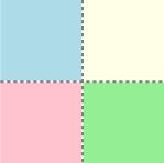
The Grid control provides a surface composed of rows and columns to display child elements. You define the rows and columns for a Grid, than assign objects to a specific row or column in the grid. You can optionally display gridlines. For more information, see Silverlight Layout System.

The following illustration shows a grid with two columns and two rows that contain colored squares. Gridlines are shown in this example.

untitled

SilverlightnDevelopers Guides

1.Silverlight 2 Bible

Silverlight

Click here to Download